A series of printed posters put up on new build development sites. July, 2012.
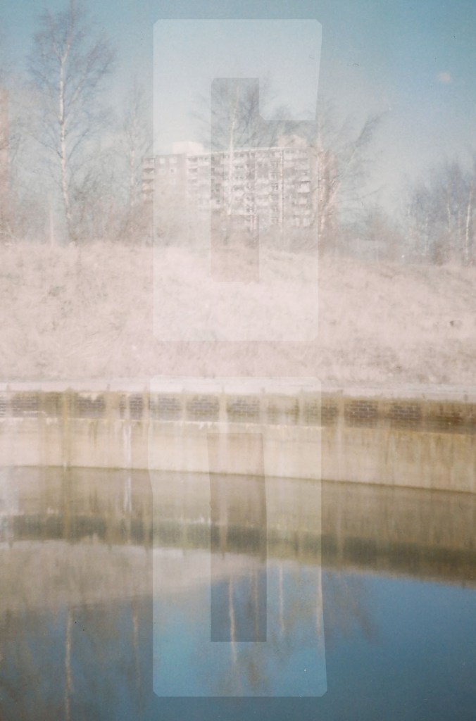
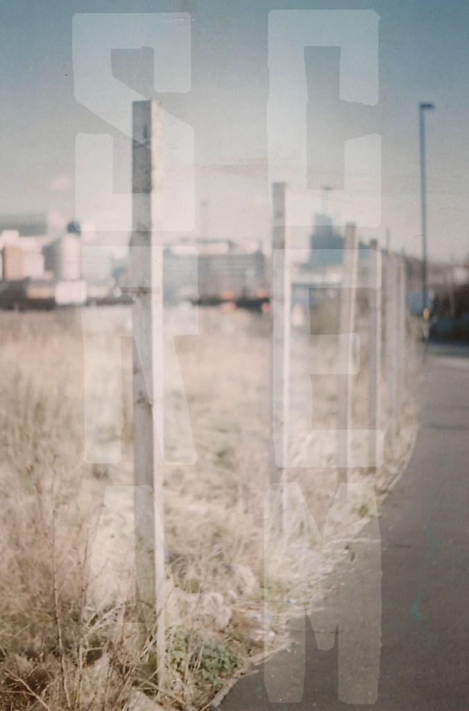
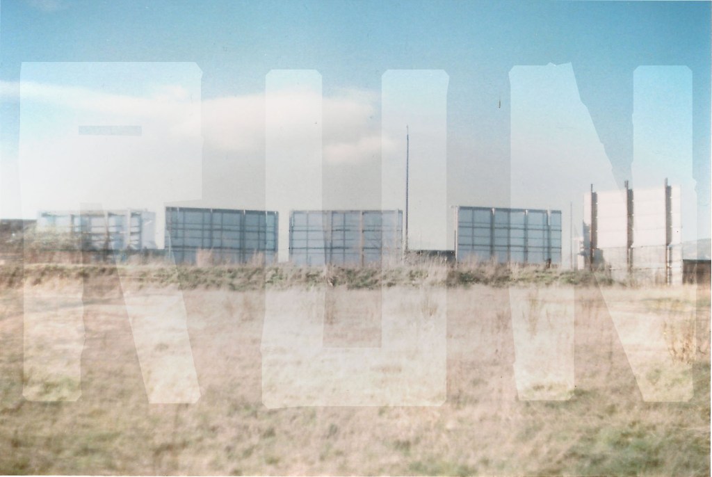
A series of printed posters put up on new build development sites. July, 2012.
I do various bits and bobs for an independent shop in Sheffield called Kuji Shop. I have been asked to design business cards, flyers, posters, adverts for print and web, window vinyls etc. But last year they asked me to design their new frontage sign, and it proved to be my biggest job to date.
The shop originally had this logo:

And sold Japanese furniture and home accessories. As it developed and changed, furniture was gradually replaced with smaller accessories and exclusive clothing and limited edition artwork. The shop now prides itself on being artist-led, and holding exclusivity with the majority of it’s products.
They asked me to design a new sign that would incorporate all of these things but also wanted to keep the original name, Kuji Shop. This is the new sign:

As the shop is constantly changing and developing, I wanted a sign that could do the same, so used brass lettering, which will weather and change colour over time. The type itself has a ragged, almost unfinished look about it and stands away from the back board.
For formalities I’ve used a plain black, semigloss back board, double strip light from above and off-white plain lettering for the website and telephone number. I’m really pleased with the finished sign, what do you think?
