Mixed media, collage, print, neon orange board. September, 2018.
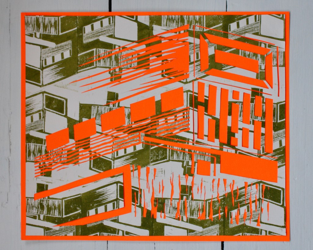
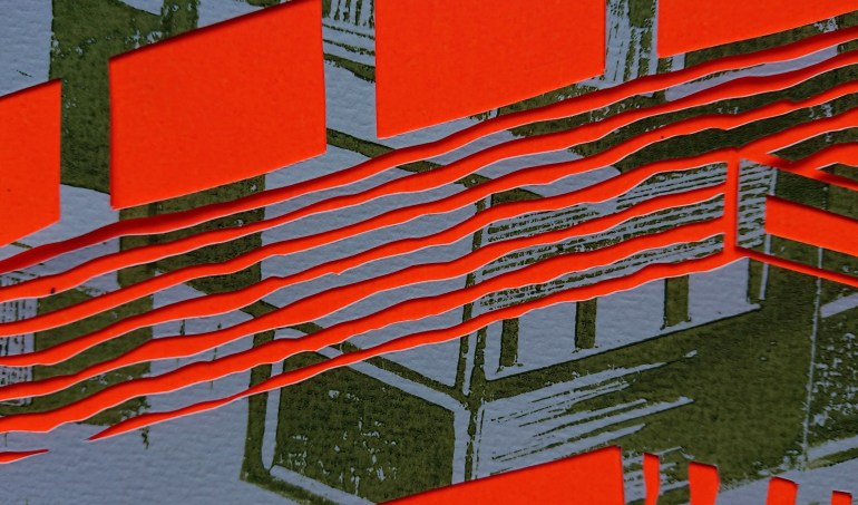
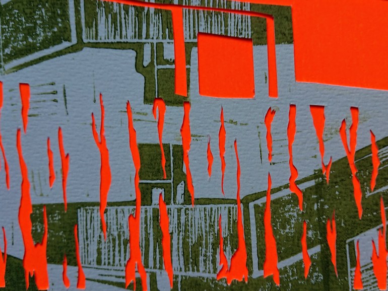
Mixed media, collage, print, neon orange board. September, 2018.
As part of the Royal Academy 250 celebrations, Salford Museum & Art Gallery launched an exciting opportunity open to all artists living, working, studying or born in Salford to show their work. The resulting exhibition is Salford Summer Show: The Open [1].
I am pleased to have my work Building detail 1, selected for the show and it is available to view in Salford Museum & Art Gallery (North and Bluestairs Galleries) until 11th November 2018.
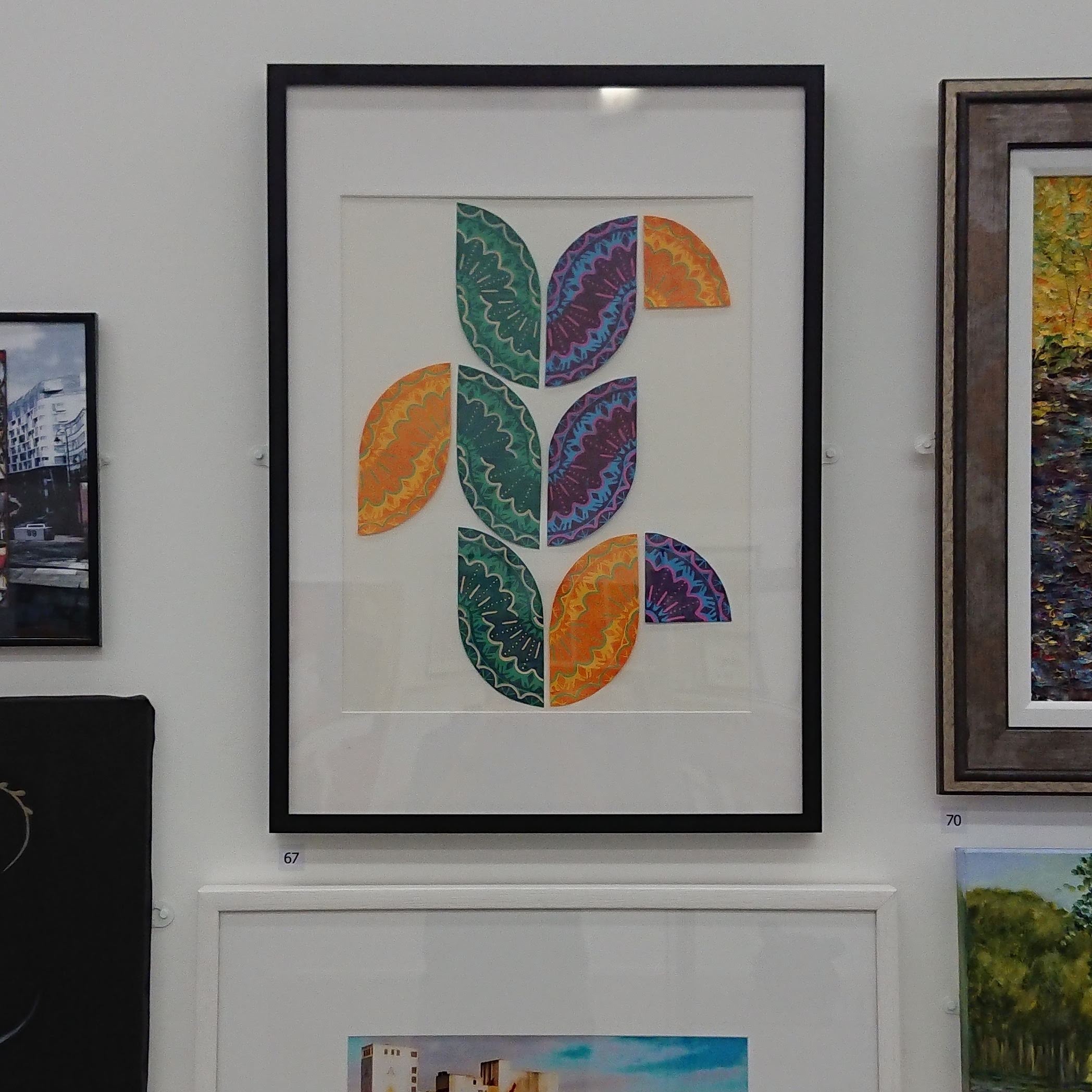
My work is a mixed media (print, acrylic, collage) piece and is available to buy at the gallery. If you visit, you can also vote for your favourite piece and the winner collects the People’s Choice Award… Hint hint!

The gallery is also hosting a special Royal Academy Takeover exhibition, celebrating 250 years of the Royal Academy in London. Salford Museum & Art Gallery have selected a range of works to display, saying:
Royal Academicians are voted in by their peers and make up some of the greatest names in painting, printmaking, sculpture and architecture.
Did you know that we hold many magnificent works by Royal Academicians in Salford’s collections? Some of which have not been on public display for a number of years.
‘The Royal Academy Takeover: The Exhibition’ will pick out the hidden gems from the collections and runs over both our venues. At Salford Museum & Art Gallery you will be able to see household names including L.S Lowry, David Hockney and Elizabeth Frink, while we introduce you to some lesser known Royal Academicians through painting, print and sculpture.
You can read more about the Royal Academy Takeover exhibition in this article by Creative Tourist. But of course, my advice is that if you can visit, you should!
Getting to exhibit artwork at the same time as these pieces by famous artists is a great opportunity, and the takeover show is a vibrant reflection of the diverse artwork made in Salford. I have picked some of my favourite pieces below.
![Salford Museum & Art Gallery Summer Show: The Open [1]](https://gregthomasart.co.uk/wp-content/uploads/2018/08/dsc_4559.jpg)
![Salford Museum & Art Gallery Summer Show: The Open [1]](https://gregthomasart.co.uk/wp-content/uploads/2018/08/dsc_4557.jpg)
![Salford Museum & Art Gallery Summer Show: The Open [1]](https://gregthomasart.co.uk/wp-content/uploads/2018/08/dsc_4556.jpg)
I do various bits and bobs for an independent shop in Sheffield called Kuji Shop. I have been asked to design business cards, flyers, posters, adverts for print and web, window vinyls etc. But last year they asked me to design their new frontage sign, and it proved to be my biggest job to date.
The shop originally had this logo:

And sold Japanese furniture and home accessories. As it developed and changed, furniture was gradually replaced with smaller accessories and exclusive clothing and limited edition artwork. The shop now prides itself on being artist-led, and holding exclusivity with the majority of it’s products.
They asked me to design a new sign that would incorporate all of these things but also wanted to keep the original name, Kuji Shop. This is the new sign:

As the shop is constantly changing and developing, I wanted a sign that could do the same, so used brass lettering, which will weather and change colour over time. The type itself has a ragged, almost unfinished look about it and stands away from the back board.
For formalities I’ve used a plain black, semigloss back board, double strip light from above and off-white plain lettering for the website and telephone number. I’m really pleased with the finished sign, what do you think?
