Mixed media (ply, treated pine, gas mask) installation, September 27, 2013
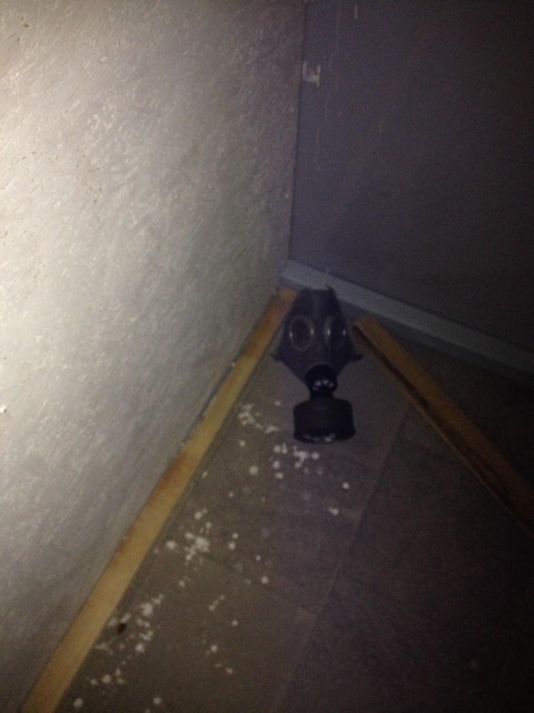

Mixed media (ply, treated pine, gas mask) installation, September 27, 2013
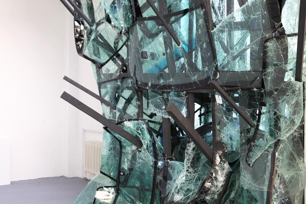
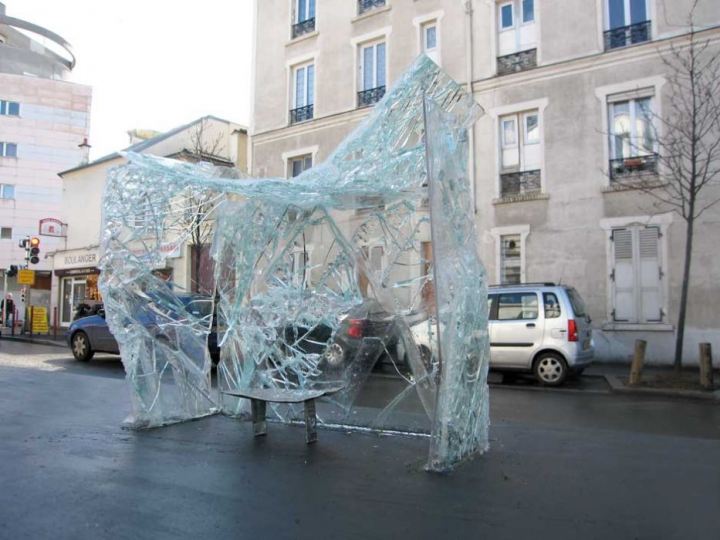
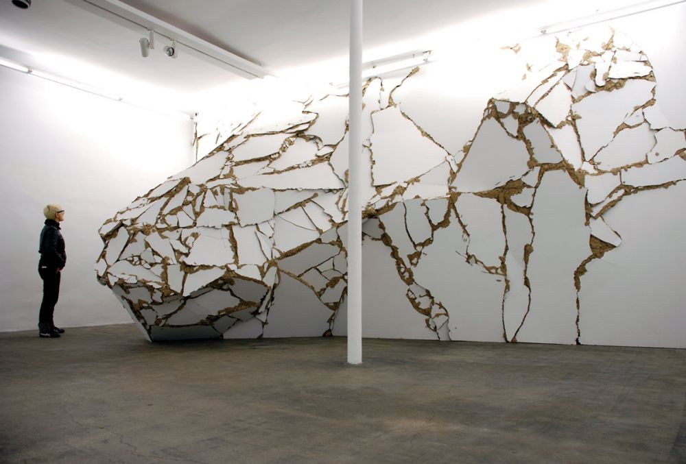

Some shots of different pieces of work by BAPTISTE DEBOMBOURG. Thanks to BUMBUMBUM for directing me to the work.
I think I love 90% of work that relates to architecture, the built environment, installation art, urban environments, text, interventions, etc. This stuff seems to tick all the boxes… What do you think? I’d like to start using my blog as a means of generating discussion, critical or otherwise, so use the comments if you have anything you’d like to say!
I saw Dialogical Abrasion by Yves Netzhammer at the Liverpool Biennial last year. It was probably one of my favourite pieces from the whole festival. I know it was last year and I probably should have blogged about it earlier but there you go.
The piece was a site-specific sculptural installation. It felt almost labyrinth like, unnerving and unsettling. Familiar objects suddenly became unfamiliar and strange. The immersive atmosphere completely overwhelming my senses…
If you ever have a chance to experience his work, you should!

After a meeting with Sheffield City Council I’ve been given the go-ahead for a new piece of work.
It’s part of their Sheffield Showcase scheme.
It is technically an exhibition, but it will have to be viewed through an unused shop’s window. So some might call it a display. Anyway, the idea of the scheme is to generate footfall around a more run down area of the city centre. It also lets students training for an award in Visual Merchandising get some much needed hands on experience of dressing windows and working with artists/designers/etc. The scheme is currently under scrutiny from the Council and talks are underway about whether to cut it’s funding (cheers Conservatives!).
The area in question is SEVENSTONE << Check out that site for info about what is planned. Though it's unlikely to go ahead anymore.
With this in mind I'll be putting my work up around the middle of March this year. Keep checking back for updates, and as ever, get in touch if you've got some feedback.

In an effort to garner some inspiration for a series of prints (that will also be transferred onto t-shirts) I’ve been mooching through one of my favourite books; Collage: Assembling Contemporary Art.

It’s a great book for anyone interested in Contemporary Art and Collage, so check it out if you can.
It’s got plenty of artists and examples of their work, but I’d totally forgotten about an artist who was a massive inspiration for my practice when I was at uni. THOMAS DEMAND creates highly technical and elaborate architectural locations and interior structures – using just paper and card. Often creating the illusion of reality, (since his work is made, photographed and then destroyed) meaning the viewer can only see each piece as a photograph.
There is a juxtaposition of mundanity and the uncanny which creates an unsettled reading of the image. The 3D model/structure becomes flat, a plane, an image of a place that was built intentionally to be seen in 2D. It is this denial that makes the viewer aware of a ‘set’; the photograph offers the viewer an answer to what they see as an ‘uncertain reality’, allowing them into the image and a chance to pull apart the illusion.

I do various bits and bobs for an independent shop in Sheffield called Kuji Shop. I have been asked to design business cards, flyers, posters, adverts for print and web, window vinyls etc. But last year they asked me to design their new frontage sign, and it proved to be my biggest job to date.
The shop originally had this logo:

And sold Japanese furniture and home accessories. As it developed and changed, furniture was gradually replaced with smaller accessories and exclusive clothing and limited edition artwork. The shop now prides itself on being artist-led, and holding exclusivity with the majority of it’s products.
They asked me to design a new sign that would incorporate all of these things but also wanted to keep the original name, Kuji Shop. This is the new sign:

As the shop is constantly changing and developing, I wanted a sign that could do the same, so used brass lettering, which will weather and change colour over time. The type itself has a ragged, almost unfinished look about it and stands away from the back board.
For formalities I’ve used a plain black, semigloss back board, double strip light from above and off-white plain lettering for the website and telephone number. I’m really pleased with the finished sign, what do you think?
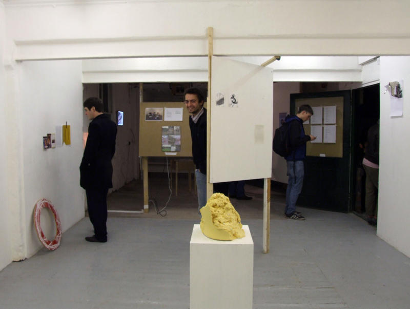
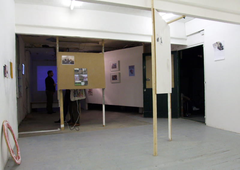
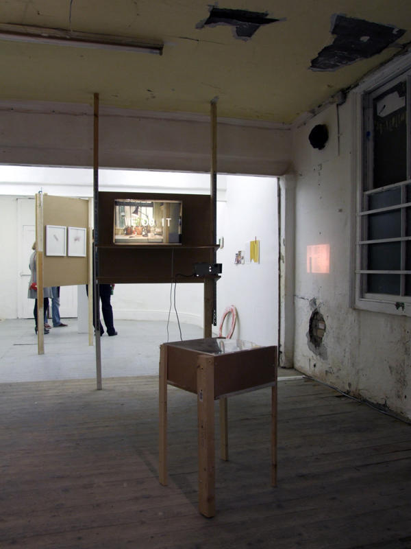
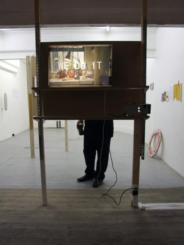
Last year I took part in two final shows at Unit 3b art space.
One was BOUND and the other was an Archive Show; a collection of works by artists who have been involved with 3b throughout it’s time.
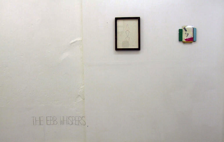
I actually only made one piece of work, but it’s nature was such that it had to stay in situ for the Archive Show, after Bound had finished.
I’ve included a plan view of the exhibition to show how many people were involved and give an idea of the space. My work was a short piece of text that I carved into the wall.